Building a new home for NLnet Labs
Over the last weeks we threw ourselves at creating a brand new website for NLnet Labs, with lots of decisions to make along the way.

By Alex Band
Over the last weeks we threw ourselves at creating a brand new website for NLnet Labs. The old one was getting rather long in the tooth from both a design and maintenance point of view. With the teeny tiny text, the drop shadows and the animated GIFs we were a <MARQUEE> tag away from 90s web design. All of this was maintained using the M4 macro processor to build static HTML pages.
The first exercise was deciding how we wanted to move forward with regards to content management. M4 notwithstanding, static site generation actually served us quite well. It’s lean, fast, has no database dependecies or attack vectors a full fledged Content Management System (CMS) would have. It also fits our workflow quite well, so we never seriously considered any of the common platforms like Wordpress, Joomla or Plone. Quite a few of us went through enough bad experiences with at least one of these to not want to go back there.
If you’re looking for an open-source static site generator, there’s actually quite some choice out there. We could have gone for one of the more popular ones, such as Hugo (in Go) or Jekyll (in Ruby), or a really cool one like Hakyll (in Haskell). In the end, seeing that most of us are proficient in Python already, Pelican turned out to be the safest choice if we wanted to do some customisation and ensure maintainability in the long term.
Design
Next up was choosing a front-end framework. We put quite some effort in exploring CSS Grid to build the layout. It looked very tempting, as it’s extremely powerful and easy to get started with. Support has been available in most browsers for over a year now. The issue was that we never ran any analytics platform like Matomo before, so we had no idea how many IE11 users we could be dealing with. In the end, we took a conservative approach and did everything in Bootstrap. Less sexy, but we weren’t aiming for a complex design anyway.
Luckily we already had a colour scheme, because some time ago we had a new logo designed.

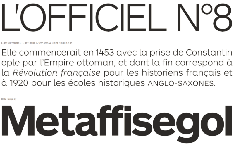
The logo uses Gill Sans as the font but we quickly came to the conclusion that that wasn’t going to work for body text. After a long search with many possible candidates, we narrowed it down to two favorites: Balto and ARS Maquette. The latter won in the end, down to having great readability and an epically beautiful ‘4’.

Putting it all together
To manage this all smoothly we set up Gitlab. This way everyone has the choice of editing pages via their favourite code editor and commit from their local machine, or do an edit via the web interface.
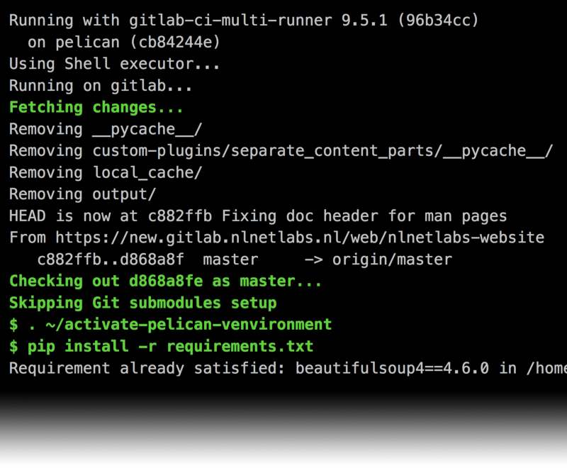
With a continuous integration pipeline set up, everything comes together really nicely:

That’s pretty much it. In true NLnet Labs style, we’ve built something fast and lean to get the job done. We’re pretty stoked with the result, we hope you like it too. Our new website should be a great starting point for the next few years. We’re wrapping up some finishing touches on the site now, such as the dedicated mini-site for all of our documentation.
If you’re missing anything, you found something quirky or have any other feedback, please let us know!

